Univariate
This tutorial covers various methods to explore the properties of individual variables in a dataset. Understanding individual variables helps us recognize the types of variables present and their behavior. For instance, visualizing variable distributions informs our modeling choices and highlights key features of the data.
Revisiting RHC Data
This tutorial reuses data from earlier examples, including those related to a predictive question, machine learning with a continuous outcome, and machine learning with a binary outcome.
First Steps
To begin, it’s important to assess the size of the dataset and the number of variables it contains. Use the dim function to check the dataset dimensions:
R will output the number of rows (observations) followed by the number of columns (variables).
Next, we need to examine which variables are present. We can list the column names (variables) with the colnames function:
colnames(ObsData)
#>  [1] "Disease.category"      "Cancer"                "Cardiovascular"
#>  [4] "Congestive.HF"         "Dementia"              "Psychiatric"
#>  [7] "Pulmonary"             "Renal"                 "Hepatic"
#> [10] "GI.Bleed"              "Tumor"                 "Immunosupperssion"
#> [13] "Transfer.hx"           "MI"                    "age"
#> [16] "sex"                   "edu"                   "DASIndex"
#> [19] "APACHE.score"          "Glasgow.Coma.Score"    "blood.pressure"
#> [22] "WBC"                   "Heart.rate"            "Respiratory.rate"
#> [25] "Temperature"           "PaO2vs.FIO2"           "Albumin"
#> [28] "Hematocrit"            "Bilirubin"             "Creatinine"
#> [31] "Sodium"                "Potassium"             "PaCo2"
#> [34] "PH"                    "Weight"                "DNR.status"
#> [37] "Medical.insurance"     "Respiratory.Diag"      "Cardiovascular.Diag"
#> [40] "Neurological.Diag"     "Gastrointestinal.Diag" "Renal.Diag"
#> [43] "Metabolic.Diag"        "Hematologic.Diag"      "Sepsis.Diag"
#> [46] "Trauma.Diag"           "Orthopedic.Diag"       "race"
#> [49] "income"                "Length.of.Stay"        "Death"
#> [52] "RHC.use"
We should also inspect the types of these variables. This can be done individually:
Or for all variables at once:
sapply(ObsData, class)
#>      Disease.category                Cancer        Cardiovascular
#>              "factor"              "factor"              "factor"
#>         Congestive.HF              Dementia           Psychiatric
#>              "factor"              "factor"              "factor"
#>             Pulmonary                 Renal               Hepatic
#>              "factor"              "factor"              "factor"
#>              GI.Bleed                 Tumor     Immunosupperssion
#>              "factor"              "factor"              "factor"
#>           Transfer.hx                    MI                   age
#>              "factor"              "factor"              "factor"
#>                   sex                   edu              DASIndex
#>              "factor"             "numeric"             "numeric"
#>          APACHE.score    Glasgow.Coma.Score        blood.pressure
#>             "integer"             "integer"             "numeric"
#>                   WBC            Heart.rate      Respiratory.rate
#>             "numeric"             "integer"             "numeric"
#>           Temperature           PaO2vs.FIO2               Albumin
#>             "numeric"             "numeric"             "numeric"
#>            Hematocrit             Bilirubin            Creatinine
#>             "numeric"             "numeric"             "numeric"
#>                Sodium             Potassium                 PaCo2
#>             "integer"             "numeric"             "numeric"
#>                    PH                Weight            DNR.status
#>             "numeric"             "numeric"              "factor"
#>     Medical.insurance      Respiratory.Diag   Cardiovascular.Diag
#>              "factor"              "factor"              "factor"
#>     Neurological.Diag Gastrointestinal.Diag            Renal.Diag
#>              "factor"              "factor"              "factor"
#>        Metabolic.Diag      Hematologic.Diag           Sepsis.Diag
#>              "factor"              "factor"              "factor"
#>           Trauma.Diag       Orthopedic.Diag                  race
#>              "factor"              "factor"              "factor"
#>                income        Length.of.Stay                 Death
#>              "factor"             "integer"             "numeric"
#>               RHC.use
#>             "numeric"
Basic Quantitative Summaries
R’s built-in summary function provides key statistics. For a continuous variable like blood.pressure, it outputs the minimum, maximum, mean, median, and quartile values:
For a factor variable like Disease.category, the summary function gives counts for each category:
Visualizing Continuous Variables
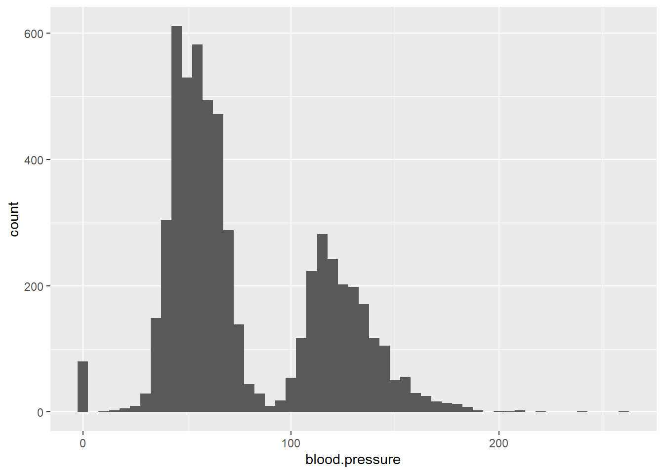
To explore continuous variables, histograms are useful for visualizing distributions:
ggplot(data = ObsData) + geom_histogram(aes(x = blood.pressure))
#> `stat_bin()` using `bins = 30`. Pick better value `binwidth`.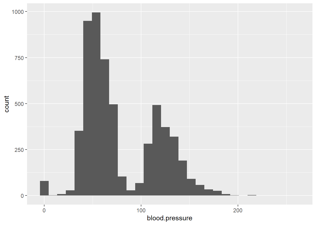
You can adjust the binwidth argument to change the detail of the histogram:
For multiple continuous variables, we can display several histograms simultaneously using the ggpubr package:
plot1 <- ggplot(data = ObsData) + geom_histogram(aes(x = blood.pressure), binwidth = 10)
plot2 <- ggplot(data = ObsData) + geom_histogram(aes(x = Temperature), binwidth = 1)
plot3 <- ggplot(data = ObsData) + geom_histogram(aes(x = Weight), binwidth = 10)
plot4 <- ggplot(data = ObsData) + geom_histogram(aes(x = Length.of.Stay), binwidth = 10)
ggarrange(plot1, plot2, plot3, plot4)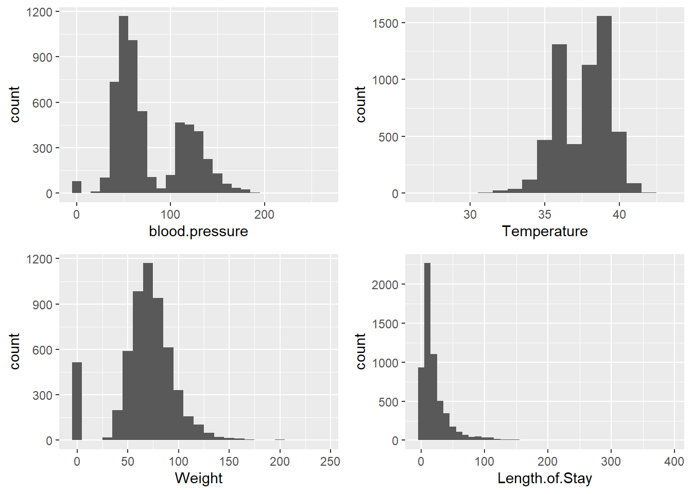
Visualizing Factor Variables
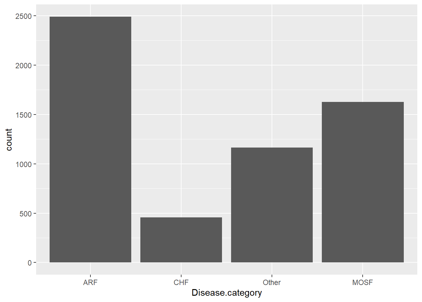
The distribution of factor variables can be visualized using bar charts:
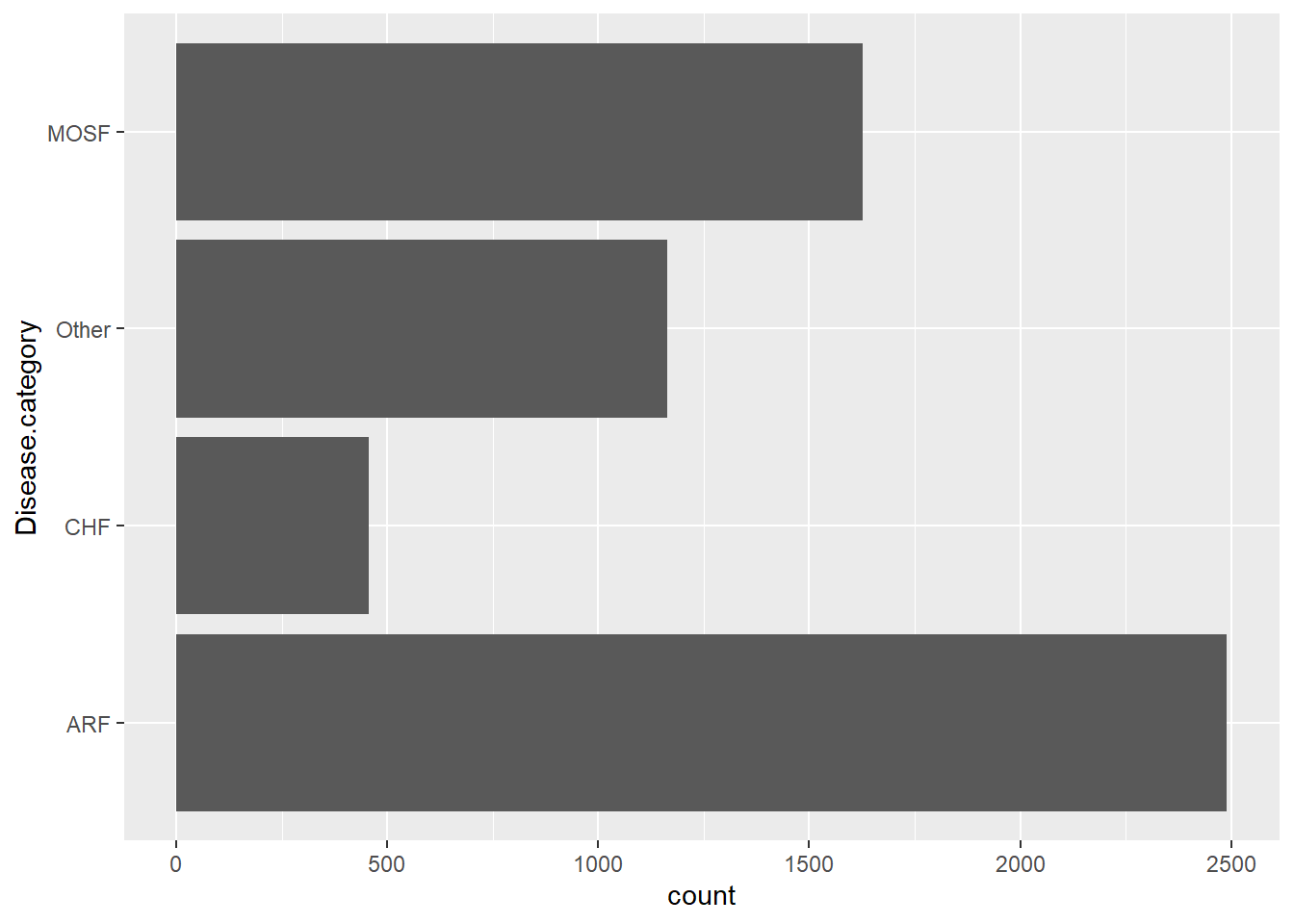
You can also display the bar chart horizontally:
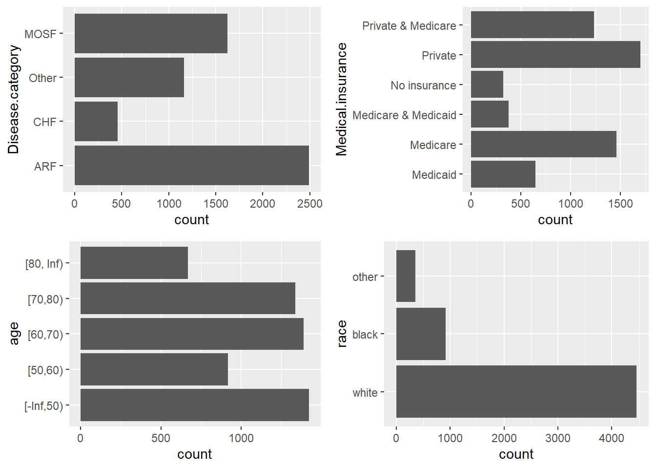
To visualize multiple factor variables side by side:
Exploring Missing Data
Before diving deeper into the analysis, it’s important to understand how much of your data is missing. You can check for missing values in your dataset using the is.na() function in R.
To see how many missing values each column contains:
| x | |
|---|---|
| Disease.category | 0 |
| Cancer | 0 |
| Cardiovascular | 0 |
| Congestive.HF | 0 |
| Dementia | 0 |
| Psychiatric | 0 |
| Pulmonary | 0 |
| Renal | 0 |
| Hepatic | 0 |
| GI.Bleed | 0 |
| Tumor | 0 |
| Immunosupperssion | 0 |
| Transfer.hx | 0 |
| MI | 0 |
| age | 0 |
| sex | 0 |
| edu | 0 |
| DASIndex | 0 |
| APACHE.score | 0 |
| Glasgow.Coma.Score | 0 |
| blood.pressure | 0 |
| WBC | 0 |
| Heart.rate | 0 |
| Respiratory.rate | 0 |
| Temperature | 0 |
| PaO2vs.FIO2 | 0 |
| Albumin | 0 |
| Hematocrit | 0 |
| Bilirubin | 0 |
| Creatinine | 0 |
| Sodium | 0 |
| Potassium | 0 |
| PaCo2 | 0 |
| PH | 0 |
| Weight | 0 |
| DNR.status | 0 |
| Medical.insurance | 0 |
| Respiratory.Diag | 0 |
| Cardiovascular.Diag | 0 |
| Neurological.Diag | 0 |
| Gastrointestinal.Diag | 0 |
| Renal.Diag | 0 |
| Metabolic.Diag | 0 |
| Hematologic.Diag | 0 |
| Sepsis.Diag | 0 |
| Trauma.Diag | 0 |
| Orthopedic.Diag | 0 |
| race | 0 |
| income | 0 |
| Length.of.Stay | 0 |
| Death | 0 |
| RHC.use | 0 |
Once identified, you can either impute the missing values or remove them, depending on the type of analysis and dataset.
For example, to remove rows with missing data:
Alternatively, you can impute missing values using methods such as mean imputation or more advanced techniques:
We will learn more about exploring missing data in the package section, and then further details about imputation in the upcoming missing data chapter.
Detecting Outliers
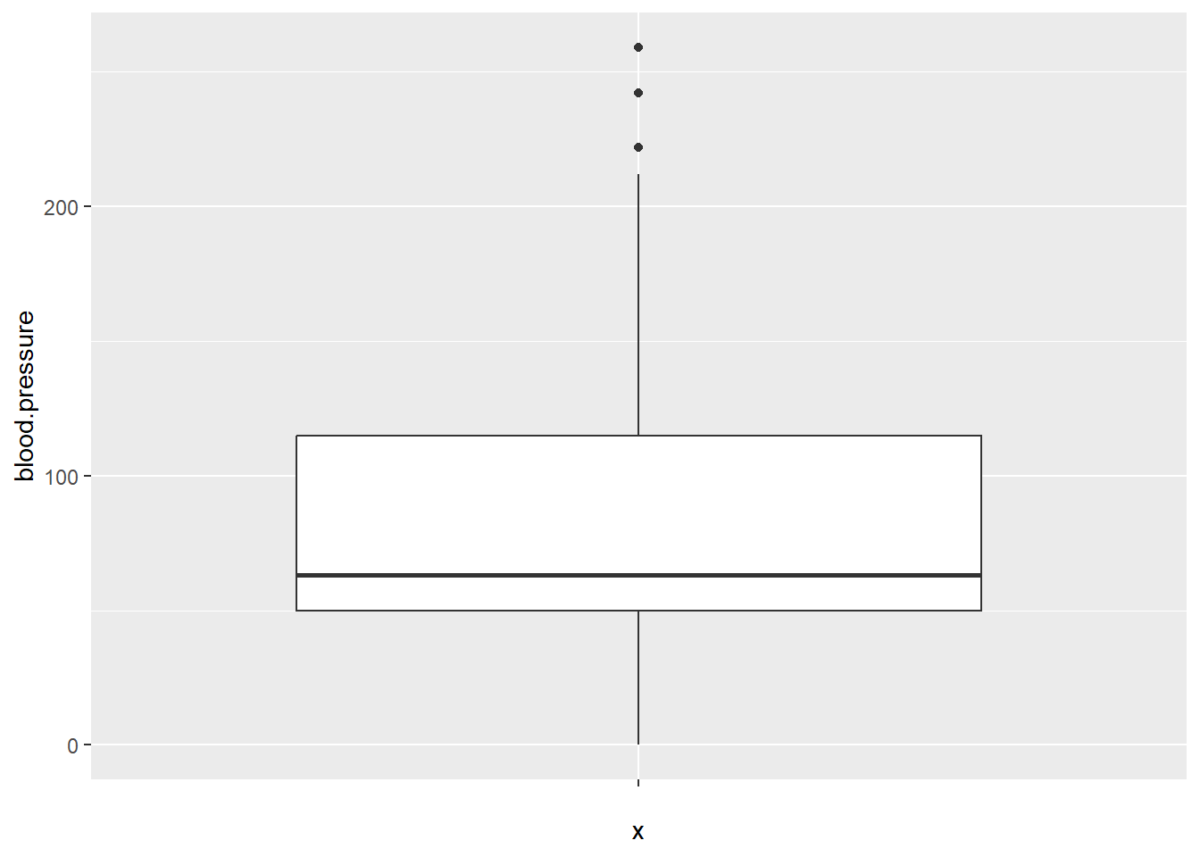
Outliers are extreme values that can distort statistical analysis. To detect outliers in continuous variables, we can use boxplots or calculate Z-scores.
For example, using a boxplot to identify outliers in the blood.pressure variable:
To detect outliers using Z-scores:
