library(tidyverse) # AI-EDIT(2026-06-23): tidyverse-default — consolidated core library() calls into library(tidyverse)

candidate_paths <- c(
  "examples/nhanes-equity/data/nhanes_equity_v6.csv",
  "../../examples/nhanes-equity/data/nhanes_equity_v6.csv"
)
data_path <- candidate_paths[file.exists(candidate_paths)][1]
nhanes <- read_csv(data_path, show_col_types = FALSE)

bmi_by_income_cycle <- nhanes |>
  filter(!is.na(BMI), !is.na(IncomeGroup), !is.na(Cycle), Age >= 20, Age <= 80) |>
  group_by(Cycle, IncomeGroup) |>
  summarise(n = n(), mean_bmi = mean(BMI), .groups = "drop") |>
filter(n >= 30)How a Plot Can Mislead
Where this fits
You have a clean, captioned worked example (viz03). This page is the audit lens: six common ways a figure that looks fine can quietly mislead a reader. Each one shows up in real research, and each one is something an AI co-pilot will produce if you do not push back.
Six failure modes
For each failure mode, you will see the problem in one sentence and the fix in one sentence. Studio time in viz06 revisits these on a deliberately flawed plot.
1. Truncated y-axis exaggeration
A small difference in means looks huge when the y-axis starts at 27 instead of 0.
-
Symptom:
coord_cartesian(ylim = c(27.5, 31.5))on a BMI mean plot, no narrative explanation. -
Fix: Start the axis at 0, or at a value justified in the caption. Use
expand_limits(y = 0)when in doubt.
2. Causal title on a descriptive plot
A title that says “X causes Y” is a causal claim. Descriptive summaries cannot support it.
- Symptom: “Income level causes BMI to rise across NHANES cycles.”
- Fix: “Mean BMI by income group across NHANES cycles in the prepared classroom dataset.”
NoteDefinition: causal overreach
A descriptive chart can show a pattern or association, but it does not prove that one factor caused another. Claiming cause from a descriptive plot is called causal overreach.
3. Smoothing across categorical time
geom_smooth(method = "lm") draws a line that implies a continuous linear trend. NHANES cycles are categorical labels, not a continuous axis.
- Symptom: A linear regression line layered across cycle bins.
-
Fix: Use
geom_line()plusgeom_point()to connect descriptive cycle summaries, with no regression overlay.
4. Weighted-vs-unweighted ambiguity
If the subtitle says “weighted” but the code does not use a survey weight variable, the reader has been misled.
-
Symptom: Subtitle: “Weighted BMI trend.” Code:
mean(BMI, na.rm = TRUE)with no weight. - Fix: State plainly that the summary is unweighted, or compute a weighted estimate using the documented weight variable.
5. Silent missingness
Rows with missing BMI or income disappear without a caption.
-
Symptom:
filter(!is.na(BMI), !is.na(IncomeGroup))deep inside a pipe with no note in the caption. - Fix: Disclose missing-value exclusions in the caption. Better: report missingness counts before the figure (you will do this on eda03 next week).
Seeing it: a before/after pair
Reading about failure modes is one thing; seeing them side by side is another. The two figures below use the same summary as the worked example on viz03. The first plot combines failure modes #1 and #2. The second plot is the honest version. (This pair is not the studio plot — the flawed plot you will audit in viz06 has its own problems for you to find.)
Before — truncated axis and causal title. The y-axis starts near the data, so small gaps look dramatic, and the title makes a claim the descriptive summary cannot support:
ggplot(
  bmi_by_income_cycle,
  aes(x = Cycle, y = mean_bmi, color = IncomeGroup, group = IncomeGroup)
) +
  geom_line(linewidth = 1.2) +
  geom_point(size = 2.5) +
  scale_color_brewer(palette = "Dark2") +
  coord_cartesian(ylim = c(27.5, 31.5)) +
  labs(
    title = "Income level causes BMI to rise across NHANES cycles",
    x = "NHANES cycle",
    y = "Mean BMI",
    color = "Income group"
  ) +
  theme_minimal(base_size = 12) +
  theme(axis.text.x = element_text(angle = 45, hjust = 1), legend.position = "bottom")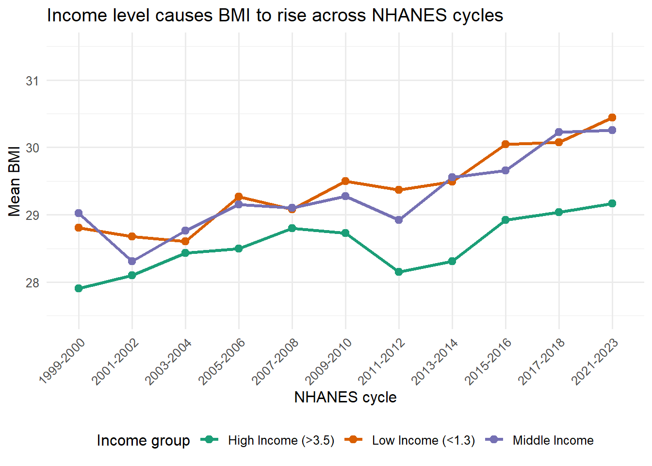
After — honest scale and descriptive title. Same data, same geometry. The axis starts at 0, the title describes instead of claiming cause, and the caption discloses the exclusions:
ggplot(
  bmi_by_income_cycle,
  aes(x = Cycle, y = mean_bmi, color = IncomeGroup, group = IncomeGroup)
) +
  geom_line(linewidth = 1.2) +
  geom_point(size = 2.5) +
  scale_color_brewer(palette = "Dark2") +
  expand_limits(y = 0) +
  labs(
    title = "Mean BMI by income group across NHANES cycles",
    subtitle = "Adults age 20-80 in the prepared class dataset; unweighted descriptive summary",
    x = "NHANES cycle",
    y = "Mean BMI",
    color = "Income group",
    caption = "Records with missing BMI, income, or cycle excluded; groups under n = 30 removed.\nDescriptive only, not a causal or population estimate."
  ) +
  theme_minimal(base_size = 12) +
  theme(axis.text.x = element_text(angle = 45, hjust = 1), legend.position = "bottom")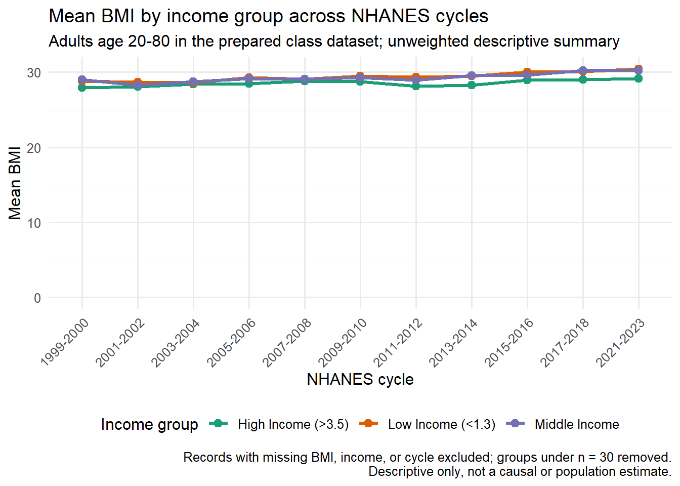
Notice what the fix did not change: the data, the geometry, and the colors are identical. Honest visualization is mostly about scale, title, and disclosure.
Why six and not sixty
You will see other failure modes in the wild — duplicated colors, default rainbow palettes, dual axes, missing legends. The six above account for most of the issues you will catch when auditing an AI-drafted plot for descriptive health data work in this course. Master these first.
A quick audit habit
When you finish a plot, ask three questions out loud:
- Could a reader make a causal claim from this title or caption?
- Could a small difference look bigger than it is because of the axis?
- Is missingness, exclusion, or small-cell count visible to the reader?
If any answer is “yes” or “I don’t know,” revise the figure or the caption before moving on.
Where this goes next
viz05 shows how to write AI prompts that produce plots you can defend, and how to audit what the AI gives you.