library(tidyverse)

candidate_paths <- c(
  "examples/nhanes-equity/data/nhanes_equity_v6.csv",
  "../../examples/nhanes-equity/data/nhanes_equity_v6.csv"
)

data_path <- candidate_paths[file.exists(candidate_paths)][1]
if (is.na(data_path)) {
  stop("Could not find examples/nhanes-equity/data/nhanes_equity_v6.csv")
}

nhanes <- read_csv(data_path, show_col_types = FALSE)Worked Example: Descriptive BMI Visualization
Where this fits
You learned the grammar of a ggplot and made one minimal scatter on the previous page. This page is the first end-to-end visualization of the term: load the cached NHANES Health Equity CSV, prepare a small descriptive summary, render one labeled figure, and write a caption that does not overclaim. We will return to this same figure in viz04 to see how easy it is to spoil with a few “improvements.”
Goal
This worked example uses the NHANES Health Equity CSV snapshot to build one descriptive visualization. The plot summarizes mean BMI by income group across NHANES cycle. It is unweighted and should be interpreted as a classroom visualization exercise, not a population estimate.
NoteDefinition: weighted vs unweighted
Weighted means the estimate accounts for survey design. Unweighted means it only summarizes the observed classroom/cache data. Use unweighted claims only as descriptive classroom practice.
Prepare a Descriptive Summary
Keep the summary intentionally simple. We are describing the prepared class dataset, not estimating a national trend.
NoteDefinition: hidden small cell count
A hidden small cell count is a group with very few observations that may be hidden inside a chart or summary. Do not make strong claims from these groups. That is why the code above keeps only groups with n >= 30.
Plot
bmi_plot <- ggplot(
  bmi_by_income_cycle,
  aes(x = Cycle, y = mean_bmi, color = IncomeGroup, group = IncomeGroup)
) +
  geom_line(linewidth = 1.2) +
  geom_point(size = 2.5) +
  scale_color_brewer(palette = "Dark2") +
  labs(
    title = "Mean BMI by income group across NHANES cycle",
    subtitle = "Adults age 20-80 in the prepared class dataset; unweighted descriptive summary",
    x = "NHANES cycle",
    y = "Mean BMI",
    color = "Income group",
    caption = "Unweighted descriptive summary; not a population estimate."
  ) +
  theme_minimal(base_size = 12) +
  theme(
    axis.text.x = element_text(angle = 45, hjust = 1),
    legend.position = "bottom",
    plot.caption = element_text(margin = margin(t = 8))
  )

bmi_plot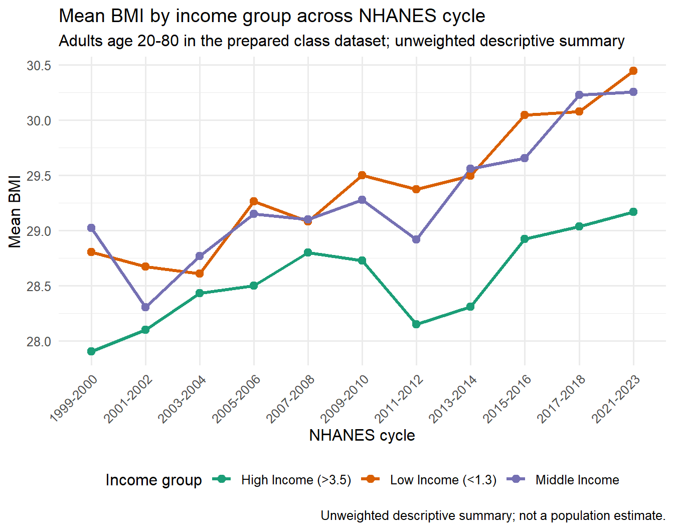
Optional Plotly Check
WarningDemo only — not graded
This pathway is a demonstration only. It is not graded and not required. Using it for graded work requires instructor approval first. The supported, graded pathway in this course is the Quarto workflow.
plotly is an R package that turns a static ggplot into an interactive web graphic — you can hover over points to see values and zoom into regions.
The core assignment uses the static ggplot2 figure above. If plotly is installed, you can preview the same plot interactively while checking labels and tooltips. This extension is optional because static Quarto output is the supported submission path.
Caption Template
Use this structure when revising your own plot:
This figure shows [measure] by [group] across [time/category] using the prepared NHANES Health Equity classroom dataset. The summary is descriptive and unweighted. Records with missing [variables] were excluded. The plot supports comparison of patterns, not causal claims or population-level estimates.
Mini Visual Audit Checklist
- Does the title describe what is plotted without overstating the claim?
- Is it clear whether the statistic is weighted or unweighted?
- Are axes, groups, and units labeled plainly?
- Are missing values or exclusions disclosed?
- Is the scale chosen to support honest comparison rather than exaggeration?
- Does the caption state the limitation that this is descriptive, not causal?
Where this goes next
Hold onto this figure. The next page walks through six common ways a plot like this can mislead a reader, and viz06 is the in-class studio where you apply the audit to a deliberately flawed version of it.