Chapter 6 Data Visualization with ggplot2
6.1 Instructions
This tutorial will introduce us to data visualization on R, specially using the ggplot R package. For this purpose, we will focus on the basic and most commonly used functions of the ggplot package. We will be able to read through the step-by-step instructions on how to use each function as well as its different arguments.
Accompanying this tutorial is a short Google quiz for your own self-assessment. The instructions of this tutorial will clearly indicate when you should answer which question.
6.2 Learning Objectives
- Be familiar with the basics of ggplot including how to graph basic scatterplot (with smoothed conditional means), line graph, bar graph, and bar chart using geometric functions.
- Get a brief understanding of coordinate functions with special emphasis on
coord_flip()andcoord_polar(). - Be able to create gridded subplots using facet functions.
- Know how to customize a graph to our own liking - including changing the texts, font, size, and color.
- Know how to export the final graph into a png file using
ggsave().
6.3 Set Up
6.3.1 Loading required packages
For this tutorial, we will only be focusing on the ggplot2 package. But we will also be using a few functions from the readr and dplyr packages from the previous tutorials.
#install.packages("dplyr")
library(dplyr)

#install.packages("readr")
library(readr)

#install.packages("ggplot2")
library(ggplot2)
6.3.2 Importing Data
Like we have learned in the previous tutorial, the first step after loading the required packages is to import the data that we will be working with! In this tutorial, we will be working with the same Demographics and Blood Pressure datasets from NHANES. However, to make things easier for us, a dataset consisting of both Demographics and Blood Pressure information have already been created, translated, and combined. As a challenge (this is completely optional), you can try to recreate this data frame on your own! Here is more information about the data frame we will be using for this tutorial: * Its name is “demo_bpx.csv” - it is a csv file * It contains the Respondent Sequence Number of each participant, along with their reported Gender, Race, Systolic and Diastolic Blood Pressures, and Blood Pressure Time in seconds. The first three are from the DEMO_H dataset, the rest are from the BPX_H dataset. * It only contains information of the first 200 participants. * The first column (X1) is automatically added by R.
demo_bpx <- read_csv("data/demo_bpx.csv")## New names:
## * `` -> ...1## Rows: 210 Columns: 7## -- Column specification --------------------------------------------------------
## Delimiter: ","
## chr (2): Gender, Race
## dbl (5): ...1, ID, Systolic, Diastolic, BPT##
## i Use `spec()` to retrieve the full column specification for this data.
## i Specify the column types or set `show_col_types = FALSE` to quiet this message.head(demo_bpx)## # A tibble: 6 x 7
## ...1 ID Gender Race Systolic Diastolic BPT
## <dbl> <dbl> <chr> <chr> <dbl> <dbl> <dbl>
## 1 1 73557 Male Non-Hispanic Black 114 76 620
## 2 2 73558 Male Non-Hispanic White 160 80 766
## 3 3 73559 Male Non-Hispanic White 140 76 665
## 4 4 73560 Male Non-Hispanic White 102 34 803
## 5 5 73561 Female Non-Hispanic White 134 88 949
## 6 6 73562 Male Mexican American 158 82 1064DO QUESTION 1 OF THE QUIZ NOW
- REVIEW What is the name of the core that the packages readr, dplyr, and ggplot2 belong to?
6.4 ggplot() and Point Geometrics
Now that our dataset is all set up, it’s time to plot our first graph! First, we need to start with an empty canvas and to do this, we need ggplot() as our base. Try running ggplot() alone. What do you see?
ggplot()
If you answered “nothing” then you are completely right! Again, ggplot() alone only acts as a blank canvas. Usually, we would only have the dataset that we want to plot in the () of ggplot(). For example:
ggplot(demo_bpx)
As for the actual graph, in order to plot it, we need geometric functions.
6.4.1 Point Geometrics
Point geometrics, geom_point(), lets you graph scatterplots. The most basic argument that you can nest in geom_point() is aes(x, y) which basically tells geom_point() the x and y variables that you want to graph! aes stands for “aesthetics,” we will cover more of this later in this tutorial.
ggplot(demo_bpx) +
    geom_point(aes(x = Systolic,
                   y = Diastolic),
               na.rm = TRUE,
show.legend = TRUE) 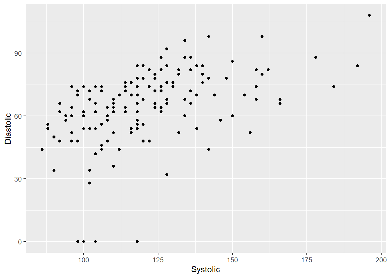
As you can see, point geometrics (and all other geometric functions) always have to go after our ggplot() function. In addition, note that ggplot() and geom_point() are separated by a +.
Functions debunked
ggplot is our blank canvas - this function is housed in the ggplot2 package! The arguments are as follows:
ggplot(Name of Data Frame, aes(x = Variable on the x-axis, y = Variable on the y-axis))
geom_point is the function we use to draw scatterplots - it is also housed in the ggplot2 package. The arguments that will be covered in this tutorial are as follows - you are welcomed to explore this function in more detail on your own:
geom_point(aes(Aesthetics - to be covered later in the tutorial), na.rm = True or False, show.legend = True or False)
For example: ggplot(demo_bpx) + geom_point(aes(x = Systolic, y = Diastolic, color = Gender), na.rm = TRUE)
DO QUESTIONS 2 & 3 OF THE QUIZ NOW
HINT: We’ve covered how to look for help within and outside of R in our very first tutorial: Basics of R and RStudio.
What do you think the argument
na.rm = TRUEdoes?What do you think the argument
show.legend = TRUEdoes?
Try it yourself 6.1
Plot a scatterplot to show the relationship between Diastolic Blood Pressure (x-axis) and Blood Pressure Time in Seconds (y-axis).
DO QUESTION 4 OF THE QUIZ NOW
- What does the “Try it yourself” graph above look like?
6.4.2 Aesthetics
Besides the x and y axes, there are other aesthetics that you can use to customize your graph as well! For example, you can change the color, size, opacity, and shape of your data points based on a particular variable of the dataset!
6.4.2.1 Colors
We can tell ggplot to use different colors for different genders using the argument color = like so:
ggplot(demo_bpx) +
  geom_point(aes(x = Systolic,
                 y = Diastolic,
                 color = Gender),
             na.rm = TRUE)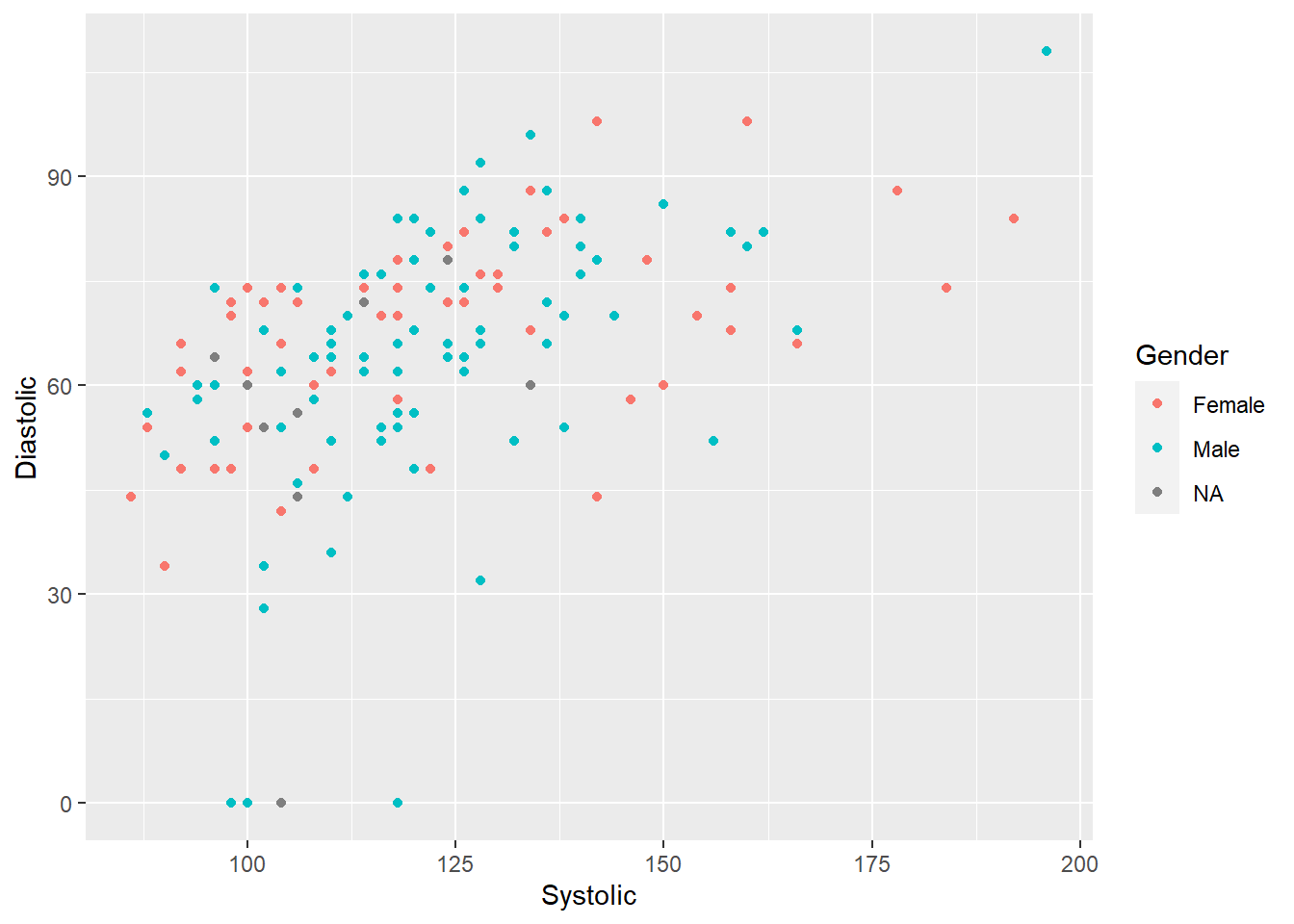
6.4.2.1.1 Missing Values
Looking at the graph above, we can see that there are a few NA data points for the variable gender. Let’s rename all of these NA values to “Unstated,” instead, to more accurately represent our data. To do this, we need to use the replace_na() function from the tidyr package like so:
#install.packages("tidry")
library(tidyr)
demo_bpx %>%
replace_na(list(Gender = "Unstated")) %>%
ggplot() +
geom_point(aes(x = Systolic,
y = Diastolic,
color = Gender),
na.rm = TRUE)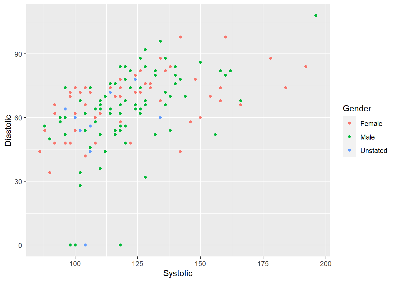
6.4.2.2 Shapes
We can also use different shapes to represent the different genders in our dataset. To do this, we use the argument shapes =. This argument is more appropriate to use this argument when we are trying to distinguish between discrete variables since there are no in-between shapes to accurately reflect continuous variables!
ggplot(demo_bpx) +
  geom_point(aes(x = Systolic,
                 y = Diastolic,
                 shape = Gender),
             na.rm = TRUE)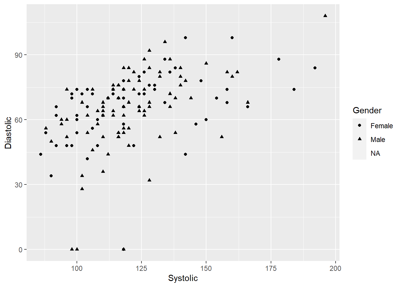
6.4.2.3 Size
You can also change the size of your data points using the argument size = and then any number. You can also use this argument to distinguish data points of different genders with different point sizes, but this is not recommended. If you want to plot points of different sizes, it is most appropriate if you use it to distinguish a particular continuous variable.
In the example below, not how the argument size = 2 is outside of the aesthetics bracket. This tells R that we want ALL of our data points to be of the same size 2.
ggplot(demo_bpx) +
  geom_point(aes(x = Systolic, y = Diastolic),
             size = 2,
             na.rm = TRUE,)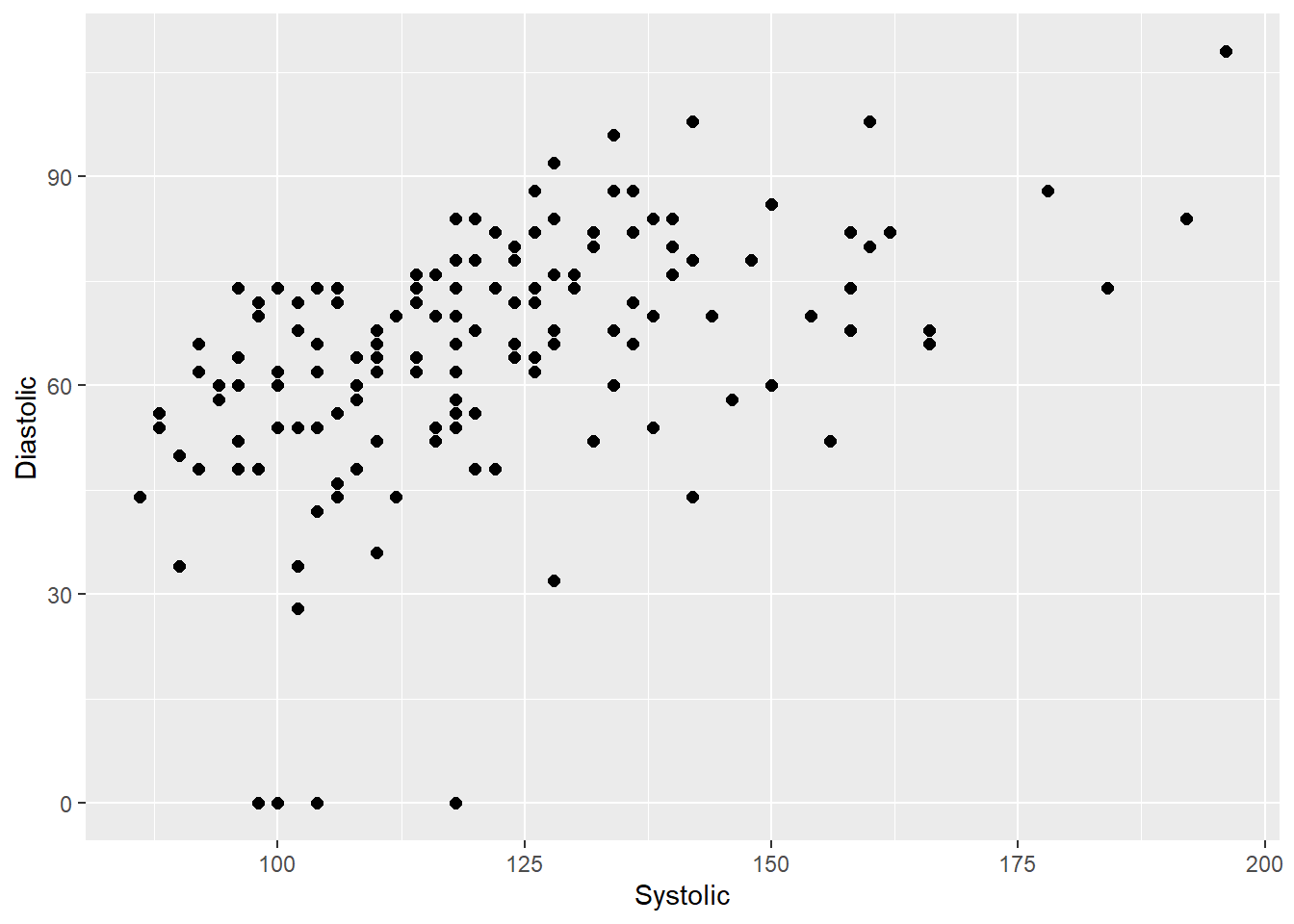
6.4.2.4 Opacity
Similar to size, if using opacity as an indication of different categories of a variable is most appropriate if the variable is continuous. So in the example below, the graph shows all data points with the same opacity because the argument alpha = 11 is outside of the aesthetics brackets.
Also note that alpha values range from 0 to 1. The other neat thing about changing the data points opacity is that we can identify where data points overlap. For example, in the graph below, you can see some data points are darker than others. This means that those data points have multiple replicates!
ggplot(demo_bpx) +
  geom_point(aes(x = Systolic, y = Diastolic),
             alpha = 0.5,
             na.rm = TRUE)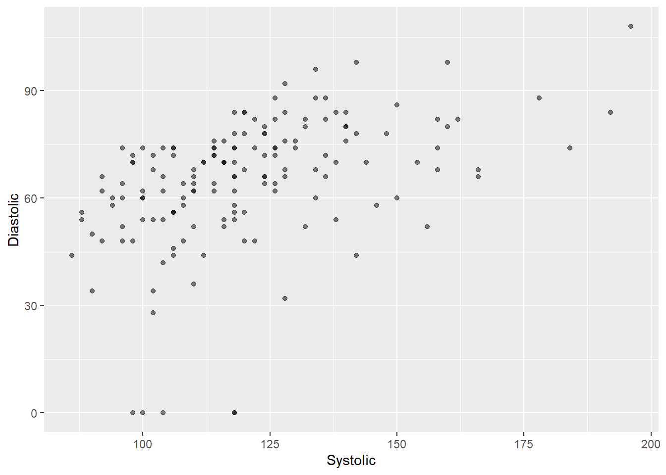
Why do you think some point aesthetics better demonstrate discrete variables while others better demonstrate continuous variables?
6.4.2.5 Jitter Position
After the graph above, you, hopefully, should have noticed that there are a lot of overlapping points in our dataset. To address this issue of overplotting, we can add random noise to each point to spread points out because no two points are likely to have same random noise. We can do this by nesting the position/argument jitter to our scatterplot like so:
ggplot(demo_bpx) +
  geom_point(aes(x = Systolic,
                 y = Diastolic,
                 color = Gender),
             na.rm = TRUE,
             position = "jitter")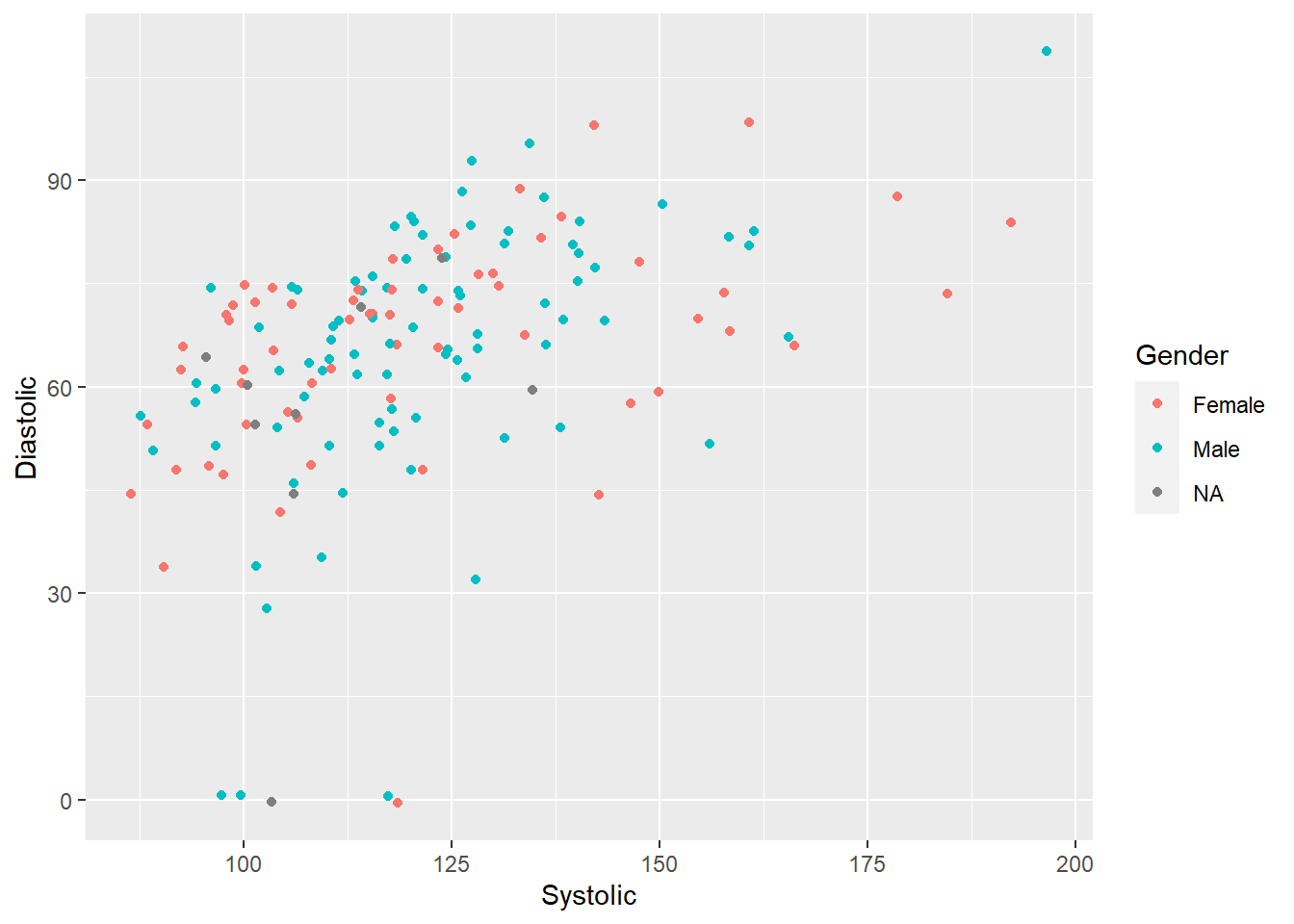
Try it yourself 6.2
Plot a scatterplot using the Diastolic (x-axis) and Systolic (y-axis) variables in the data frame demo_bpx where all of the data points are blue.
DO QUESTION 5 OF THE QUIZ NOW
- Which is the correct code for the question above?
6.5 Multiple Geometric Functions under one ggplot
Now that you’re more familiar with ggplot() and geom_point(), we can try layering multiple graph types in one single ggplot canvas! For example, we can layer a line graph on top of a scatterplot.
ggplot(demo_bpx) +
  geom_point(aes(x = Systolic, y = Diastolic, color = Gender),
             na.rm = TRUE) +
  geom_smooth(aes(x = Systolic, y = Diastolic),
              method = "loess",
              formula = y ~ x,
              na.rm = TRUE)
To clean up our codes even more, we can nest the aesthetics into the ggplot() function instead of the geometric functions. But note that everything you nest in your ggplot() will be applied to all following geometrics.
ggplot(demo_bpx, aes(x = Systolic, y = Diastolic)) +
    geom_point(aes(color = Gender),
               na.rm = TRUE) +
    geom_smooth(method = "loess",
                formula = y ~ x,
                na.rm = TRUE)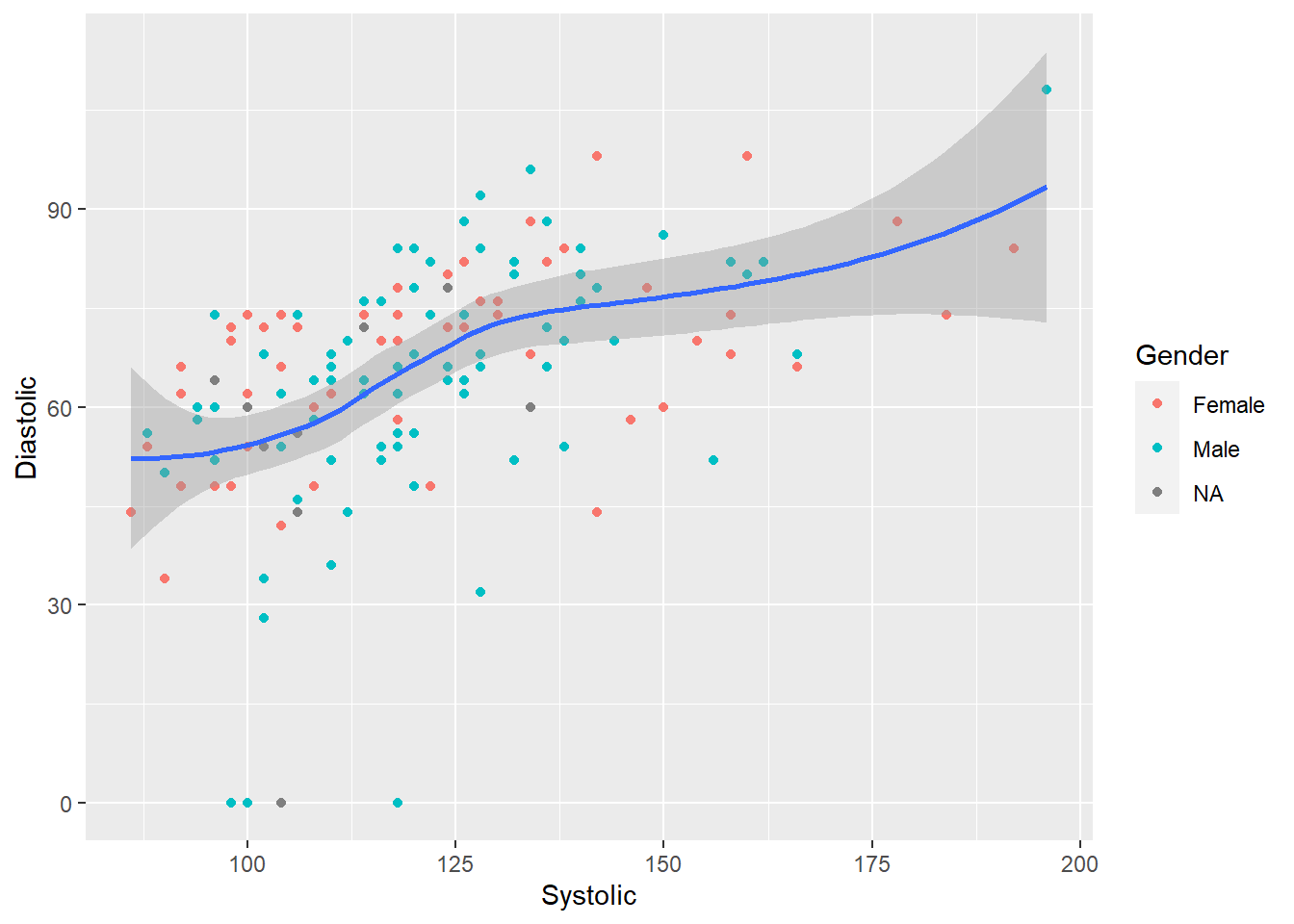
Functions debunked
geom_smooth is how we show the smoothed conditional means line on our scatterplot. The arguments are as follows:
geom_smooth(mapping = aes(Aesthetics), method = “Smoothing Method (Function)”, formula = Formula to use in Smoothing Function, na.rm = True or False, show.legend = True or False, se = True or False)
DO QUESTION 6 OF THE QUIZ NOW
- What do you think the argument
se = FALSEdoes?
6.6 Other Geometric Functions
Aside from geom_point(), there are other geometric functions that we can use to plot different types of graphs. Note that this list of geometrics functions is not extensive, and you are encouraged to explore more about them on R using the ? or ?? command or on this website about ggplot!
6.6.1 Bar graph
We use geom_bar() to create bar graphs. Different than geom_point(), geom_bar() only needs us to define either the x or y aesthetic, not both. This is because one of the axes needs to be the count of whatever variable we chose! For example, if we want to count how many individuals there are of each reported gender:
ggplot(demo_bpx) +
    geom_bar(aes(x = Gender))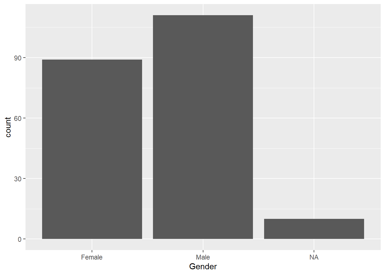
We can also tell R to calculate the proportion of each gender instead of counting:
ggplot(demo_bpx) +
    geom_bar(aes(x = Gender, y = ..prop.., group = 1))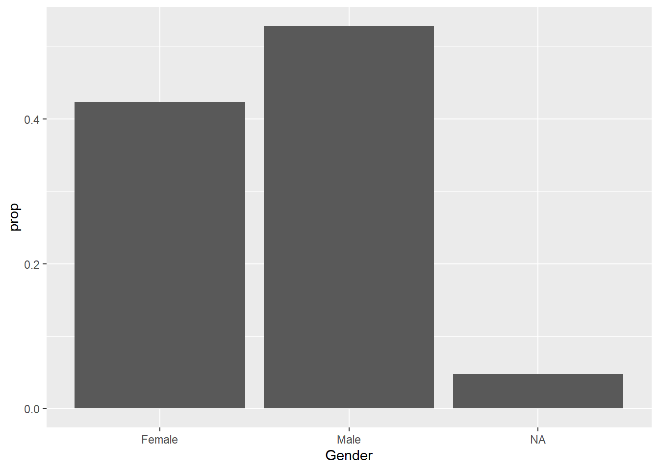
6.6.1.1 Fill Position
A neat argument/position that we can nest in geom_bar() is fill. Fill lets us add another variable to our graph and further divides up our columns into separate categories. For example, if we want to know the different combination of genders and races in our dataset:
ggplot(demo_bpx) +
    geom_bar(aes(x = Gender, fill = Race))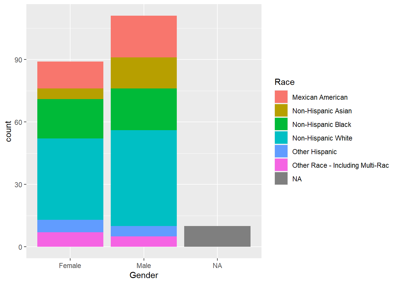
6.6.1.2 Dodge Position
Another option is the dogdge argument/position. This argument separates our columns into smaller, side-by-side columns so we can easily compare the different variables.
ggplot(demo_bpx) +
  geom_bar(aes(x = Gender, fill = Race),
           position = "dodge")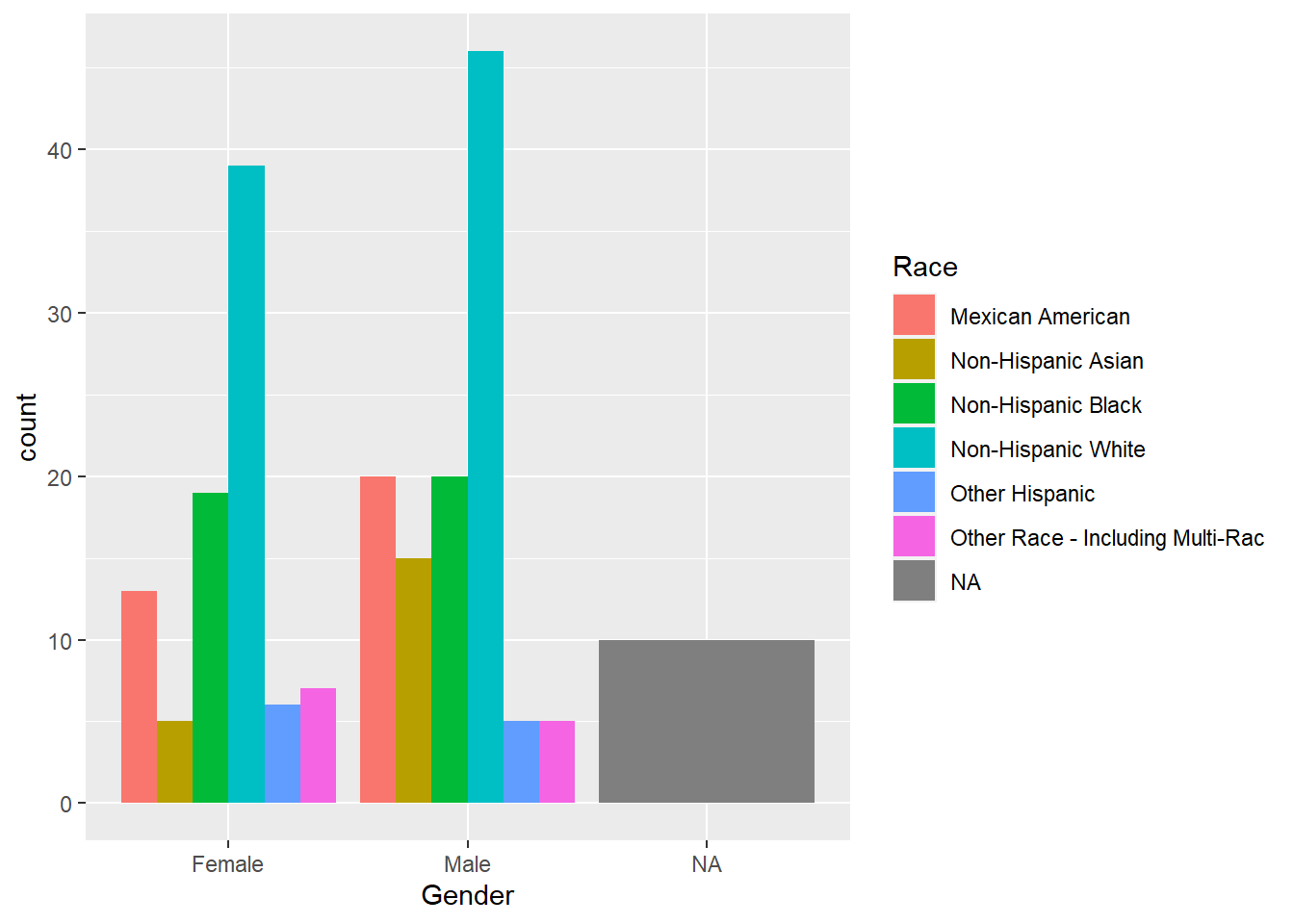
Another way that we can choose to present our bar graph is in the form of a circular graph. To do this, we can add another function coord_polar() to our ggplot canvas.
ggplot(demo_bpx, aes(x = Gender)) +
  geom_bar() +
  coord_polar()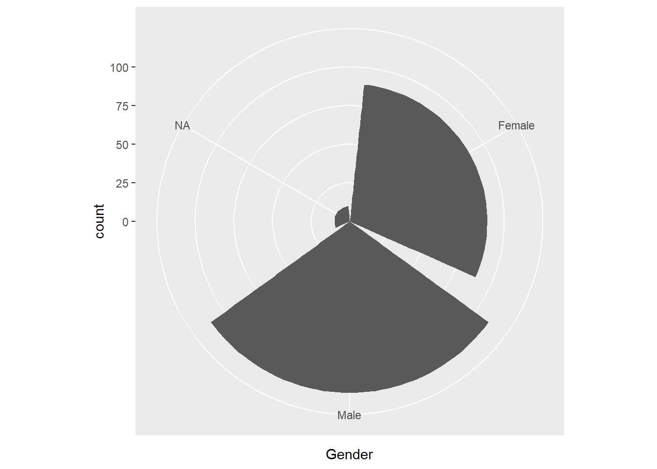
ggplot(demo_bpx, aes(x = Race)) +
  geom_bar() +
  coord_polar()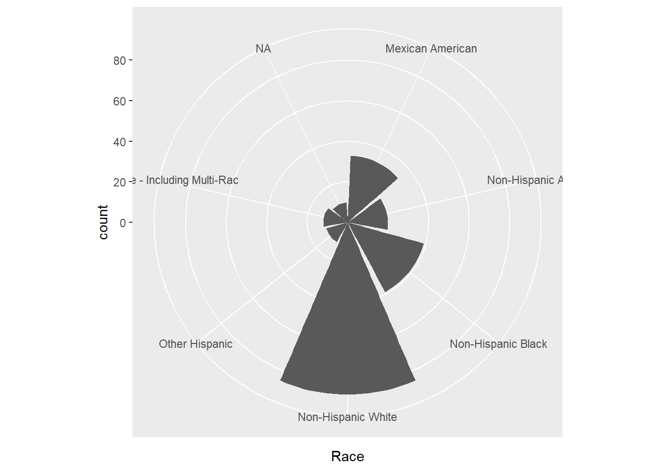
6.6.2 Line Graph
Another graph type that the ggplot R package offers is line graph. To plot a line graph, we use the function geom_line().
ggplot(demo_bpx) +
    geom_line(aes(x = Systolic, y = Diastolic), na.rm = TRUE)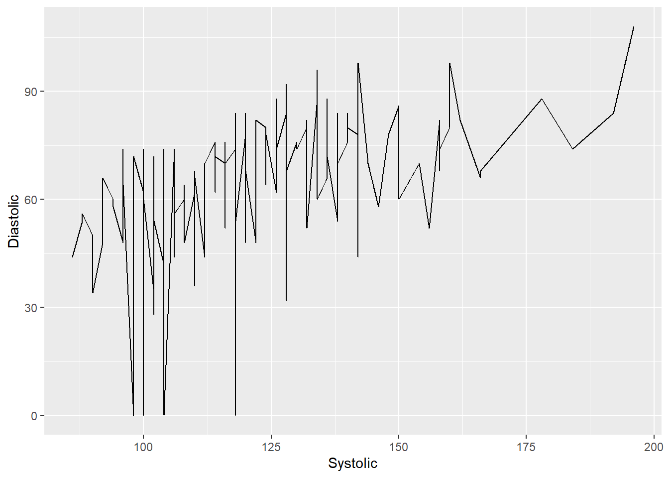
Line graphs may also be an interesting way for us to demonstrate ranges of a particular continuous variable of a categorical variable. For example, we can see the range of Systolic Blood Pressures of different races with the following graph:
ggplot(demo_bpx) +
    geom_line(aes(x = Systolic, y = Race), na.rm = TRUE)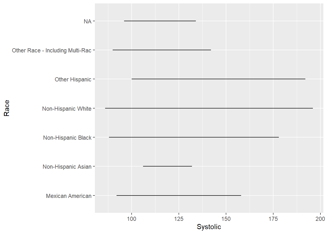
6.6.3 Boxplot
If you are not a fan of the line graph above, boxplots is another option that we can explore together. To plot a boxplot, we use geom_boxplot() like so:
ggplot(demo_bpx, aes(x = Systolic, y = Race)) +
  geom_boxplot(na.rm = TRUE)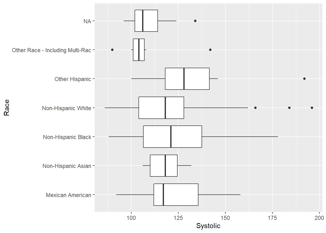
ggplot(demo_bpx, aes(x = Gender, y = Diastolic)) +
  geom_boxplot(na.rm = TRUE)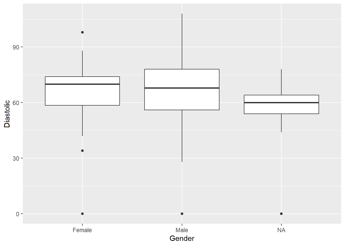
6.6.4 Frequency Polygon
Frequency polygon is another option that we can explore. They are similar to bar graphs, except frequency polygon visualize the counts with lines. We can plot frequency polygons using geom_freqpoly() like so:
ggplot(demo_bpx) +
    geom_freqpoly(aes(x = Systolic), binwidth = 5, na.rm = TRUE)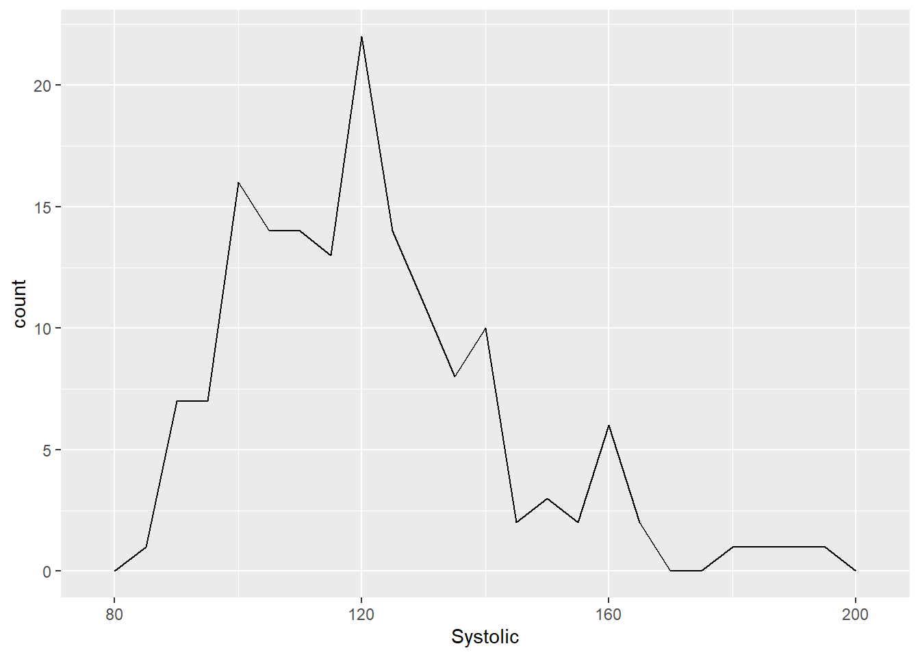
Since geom_freqpoly() divides the variable in the x axis into bins before counting the number of observations in each bin, we can further customize how we want our frequency polygon to look by changing the binwidth.
Try it yourself 6.3
Try increasing and decreasing the binwidth of a frequency polygon. What differences do you see? What does binwidth actually mean?
ggplot(demo_bpx) +
    geom_freqpoly(aes(x = Systolic), binwidth = 1, na.rm = TRUE)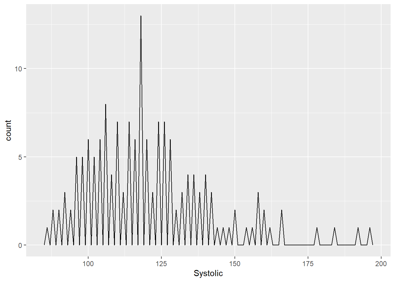
ggplot(demo_bpx) +
    geom_freqpoly(aes(x = Systolic), binwidth = 20, na.rm = TRUE)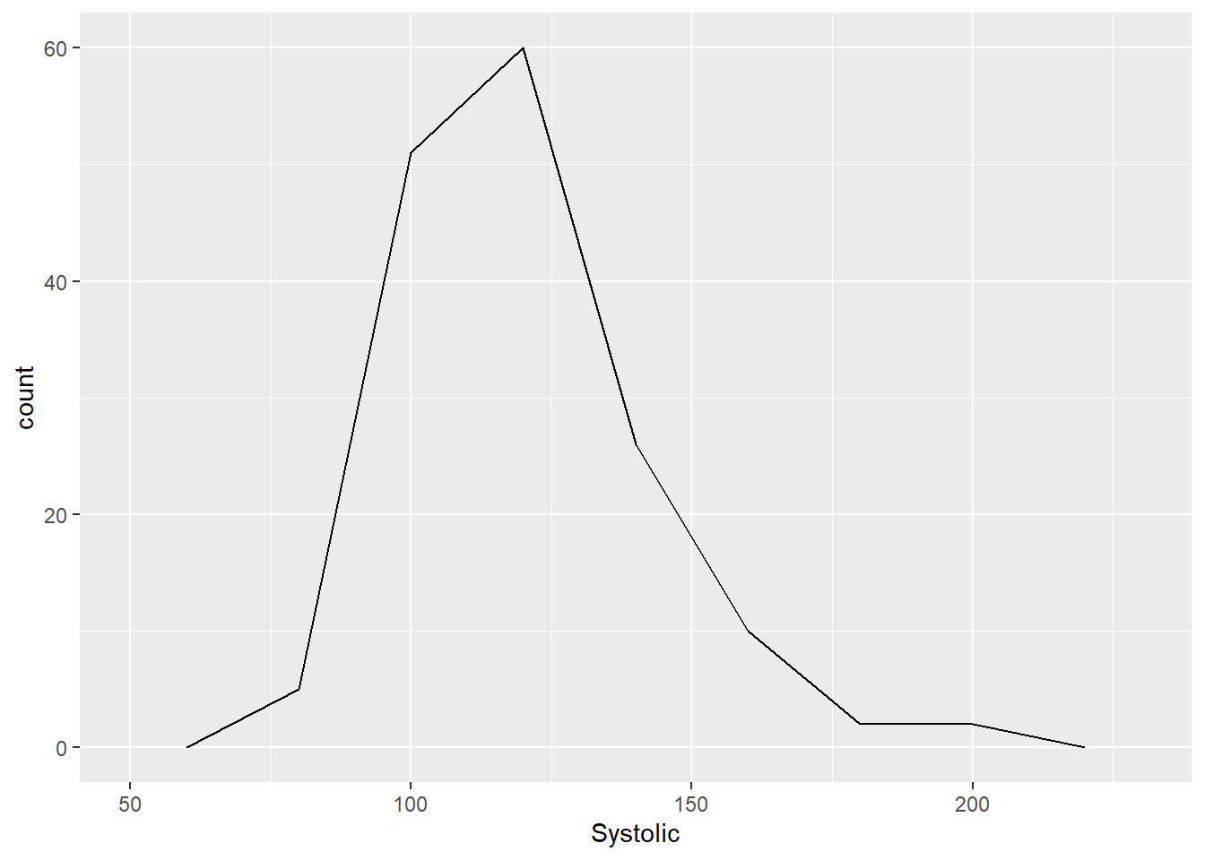
We can also layer multiple geom_freqpoly() on each other and give them different colors:
ggplot(demo_bpx) +
    geom_freqpoly(aes(x = Systolic, color = "Systolic"), binwidth = 10, na.rm = TRUE) +
    geom_freqpoly(aes(x = Diastolic, color = "Diastolic"), binwidth = 10, na.rm = TRUE)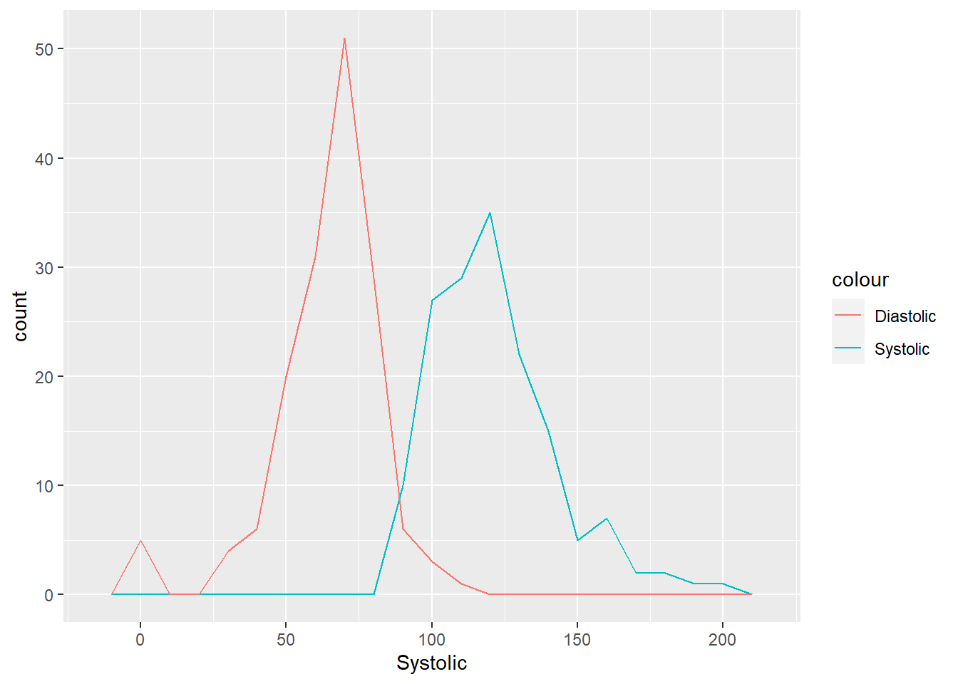
You may notice that the x axis label for the graph above is incorrect! And the legend title is also wrong. Don’t worry! We will go over how to manually add and edit graph elements later in this tutorial.
DO QUESTIONS 7 & 8 OF THE QUIZ NOW
Increasing the binwidth of a bar graph makes the graph more detailed. (True or False)
Match the geometrics with the correct graph type.
6.7 Facet Functions
Aside from using aesthetics, facet_wrap() is another good option to create subplots based on categorical variables. You can create divide the data up into subplots by 1 or 2 variables. Run the codes below to see what these two situations would look like.
ggplot(demo_bpx) +
  geom_point(aes(x = Diastolic, y = Systolic), na.rm = TRUE) +
  facet_wrap(~ Gender, nrow = 3)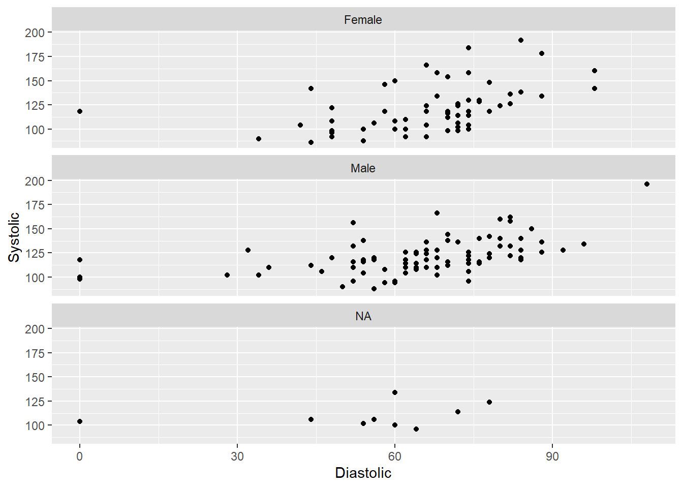
ggplot(demo_bpx) +
  geom_point(aes(x = Diastolic, y = Systolic), na.rm = TRUE) +
  facet_grid(Race ~ Gender)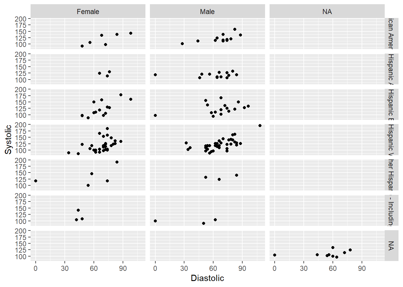
DO QUESTION 9 OF THE QUIZ
- It is most useful to use facet functions when plotting continuous variables.
Try it yourself 6.4
Try recreating the graph above but without any missing (NA) values.
HINT: Filter out any information we do not need using logical operators!
6.8 Customizing Graph Elements
We can customize how our graph looks like with different graph elements including graph title, axes labels, legendes, etc. In this section, we will cover as many graph elements as possible.
But for your own information and exploration, more information on editing graph elements can be found here. Here is also a list of colors that R recognizes that may come in handy.
Going back to the frequency polygon above where the x axis label is incorrect, this is what the code for the correct graph would look like:
ggplot(demo_bpx) +
    geom_freqpoly(aes(x = Systolic, color = "Systolic"), binwidth = 10, na.rm = TRUE) +
    geom_freqpoly(aes(x = Diastolic, color = "Diastolic"), binwidth = 10, na.rm = TRUE) +
    labs(x = "Blood Pressure (Hg mm)", color = "Type of Blood Pressure")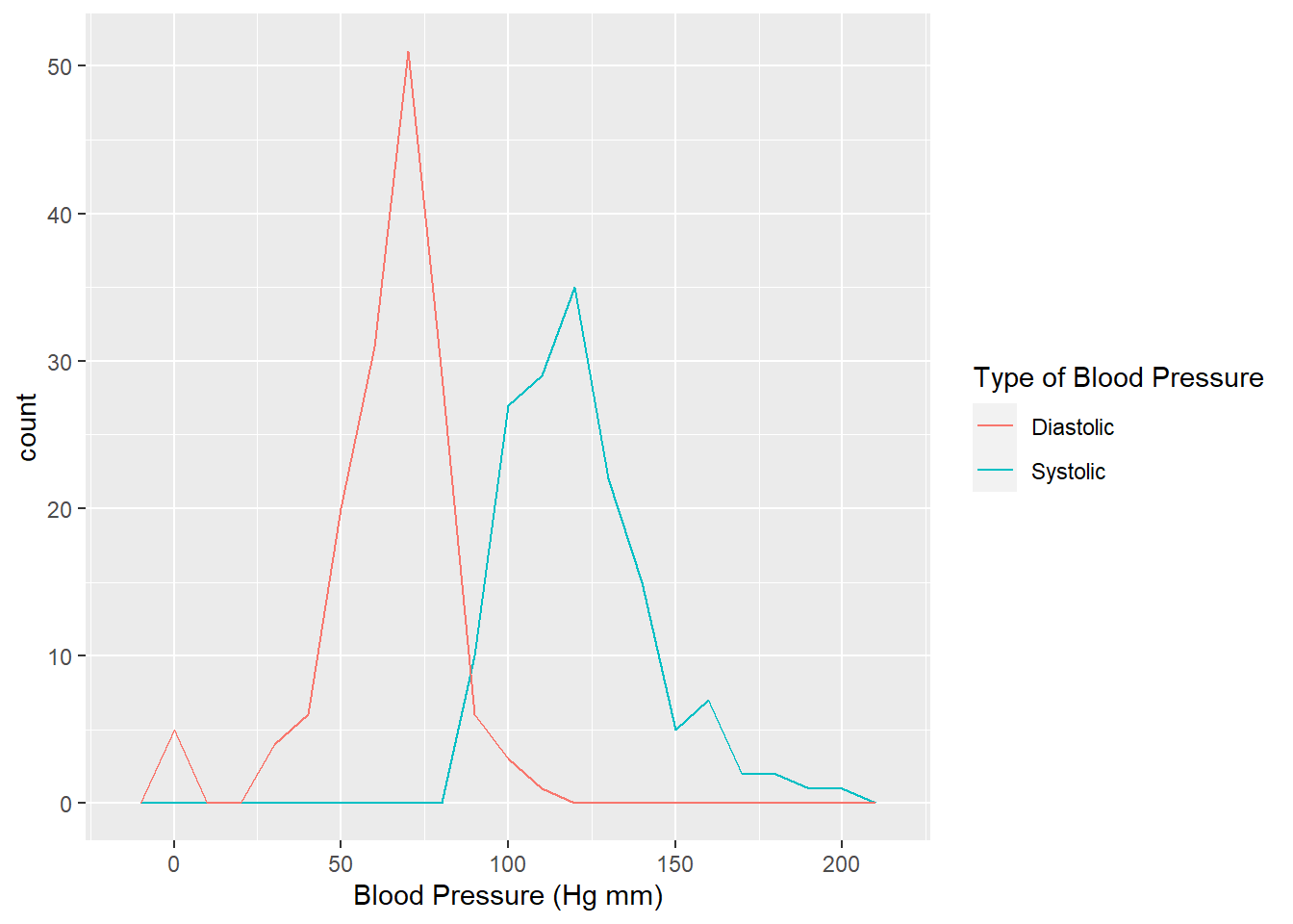
The first three lines of codes are similar to what we have previously, and the last one is new. Let’s go over the last line of codes together in the following functions debunked.
Functions bebunked
labs lets us change the axes labels, graph title, and legend title! The basic arguments are as follows:
labs(title = “Title of Graph,” x = “x-axis label,” y = “y-axis label,” color = “Legend Title”)
For example: labs(x = "Blood Pressure (Hg mm)", color = "Legend")
We can customize our graphs even more by changing the texts’ fonts, emphasis, or even size! To do this, we can nest multiple arguments in a function called theme(). Going back to the main objective of our tutorial: create a graph that shows the relationship between Diastolic and Systolic Blood Pressure of the first 200 Males and Females in the 2013-2014 NHANES datasets, let us recall what that graph originally looks like:
ggplot(demo_bpx) +
    geom_point(aes(x = Systolic, y = Diastolic, color = Gender),
             na.rm = TRUE,
             position = "jitter") +
    geom_smooth(aes(x = Systolic, y = Diastolic),
                method = "loess",
                formula = y ~ x,
                na.rm = TRUE)
Now, we can change the axes labels, legend title, and add a graph title using labs():
ggplot(demo_bpx) +
    geom_point(aes(x = Systolic, y = Diastolic, color = Gender),
             na.rm = TRUE,
             position = "jitter") +
    geom_smooth(aes(x = Systolic, y = Diastolic),
                method = "loess",
                formula = y ~ x,
                na.rm = TRUE) +
    labs(title = "Systolic vs. Diastolic Blood Pressures of Different Genders",
         x = "Systolic Blood Pressure (mm Hg)",
         y = "Diastolic Blood Pressure (mm Hg)",
         color = "Genders of Respondents")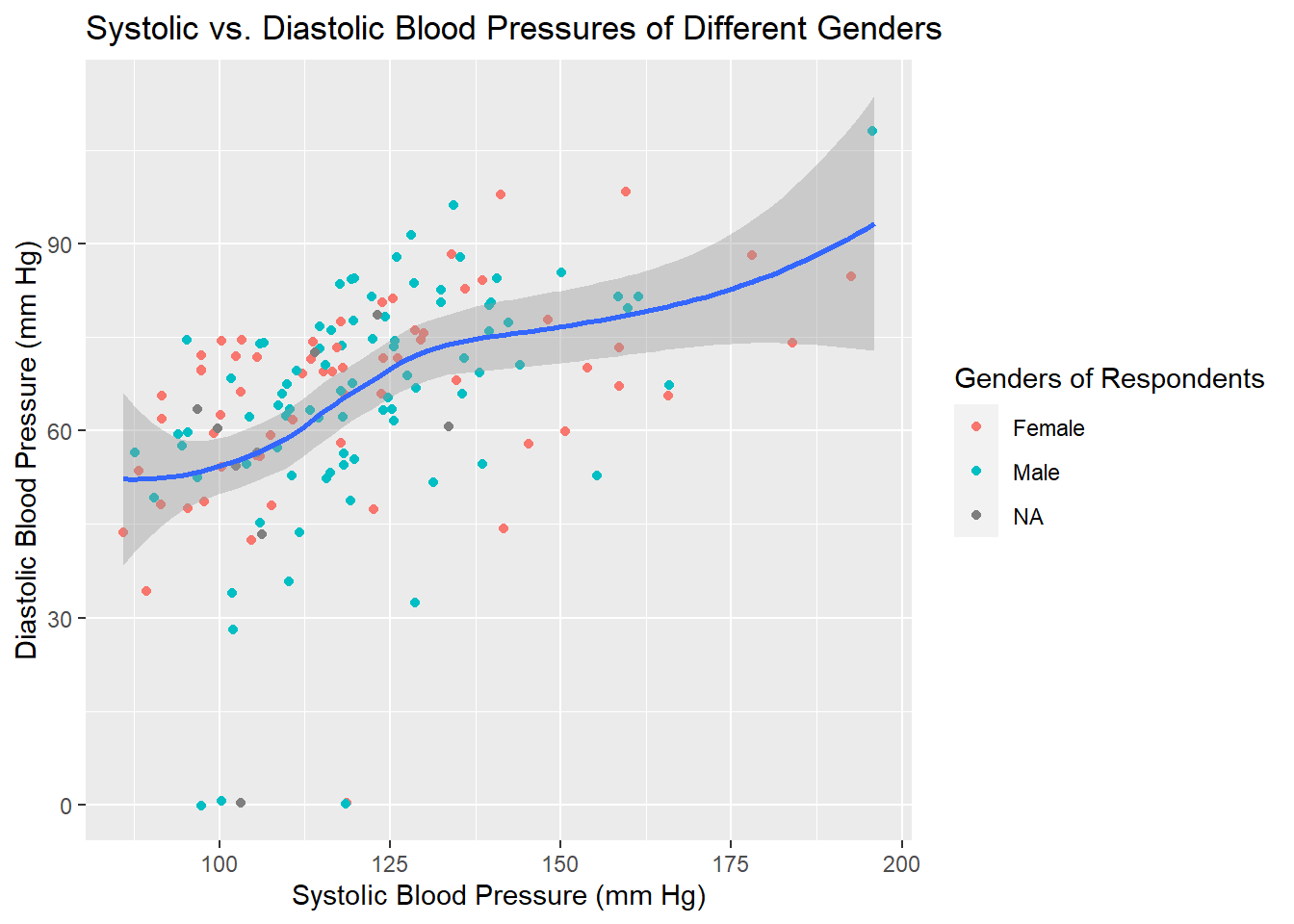
After that, we can use theme() to change the font, emphasis, size, and color of our texts.
ggplot(demo_bpx) +

    geom_point(aes(x = Systolic, y = Diastolic, color = Gender),
             na.rm = TRUE,
             position = "jitter") +

    geom_smooth(aes(x = Systolic, y = Diastolic),
                method = "loess",
                formula = y ~ x,
                na.rm = TRUE) +

    labs(title = "Systolic vs. Diastolic Blood Pressures of Different Genders",
         x = "Systolic Blood Pressure (mm Hg)",
         y = "Diastolic Blood Pressure (mm Hg)",
         color = "Genders of Respondents") +

    theme(plot.title = element_text(family = "Helvetica", face = "bold", size = 20, color = "cyan4"),
          axis.title = element_text(family = "Helvetica", size = 15),
          axis.text = element_text(family = "Helvetica", size = 12),
          legend.title = element_text(family = "Helvetica", face = "italic", size = 15),
          legend.text = element_text(family = "Helvetica", size = 12))
## Warning in grid.Call(C_stringMetric, as.graphicsAnnot(x$label)): font family not
## found in Windows font database
## Warning in grid.Call(C_stringMetric, as.graphicsAnnot(x$label)): font family not
## found in Windows font database## Warning in grid.Call(C_textBounds, as.graphicsAnnot(x$label), x$x, x$y, : font
## family not found in Windows font database
## Warning in grid.Call(C_textBounds, as.graphicsAnnot(x$label), x$x, x$y, : font
## family not found in Windows font database## Warning in grid.Call(C_stringMetric, as.graphicsAnnot(x$label)): font family not
## found in Windows font database## Warning in grid.Call(C_textBounds, as.graphicsAnnot(x$label), x$x, x$y, : font
## family not found in Windows font database
## Warning in grid.Call(C_textBounds, as.graphicsAnnot(x$label), x$x, x$y, : font
## family not found in Windows font database

## Warning in grid.Call(C_textBounds, as.graphicsAnnot(x$label), x$x, x$y, : font
## family not found in Windows font database
## Warning in grid.Call(C_textBounds, as.graphicsAnnot(x$label), x$x, x$y, : font
## family not found in Windows font database
## Warning in grid.Call(C_textBounds, as.graphicsAnnot(x$label), x$x, x$y, : font
## family not found in Windows font database
## Warning in grid.Call(C_textBounds, as.graphicsAnnot(x$label), x$x, x$y, : font
## family not found in Windows font database
## Warning in grid.Call(C_textBounds, as.graphicsAnnot(x$label), x$x, x$y, : font
## family not found in Windows font database
## Warning in grid.Call(C_textBounds, as.graphicsAnnot(x$label), x$x, x$y, : font
## family not found in Windows font database
## Warning in grid.Call(C_textBounds, as.graphicsAnnot(x$label), x$x, x$y, : font
## family not found in Windows font database
## Warning in grid.Call(C_textBounds, as.graphicsAnnot(x$label), x$x, x$y, : font
## family not found in Windows font database## Warning in grid.Call.graphics(C_text, as.graphicsAnnot(x$label), x$x, x$y, :
## font family not found in Windows font database## Warning in grid.Call(C_textBounds, as.graphicsAnnot(x$label), x$x, x$y, : font
## family not found in Windows font database
## Warning in grid.Call(C_textBounds, as.graphicsAnnot(x$label), x$x, x$y, : font
## family not found in Windows font database
## Warning in grid.Call(C_textBounds, as.graphicsAnnot(x$label), x$x, x$y, : font
## family not found in Windows font database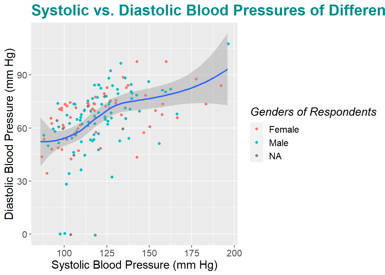
Functions debunked
Some basic arguments of theme() are as follows:
theme(plot.title = element_text(family = “Font Name,” face = “Emphasis Type, size = Size Number, color =”A Color that R Recognizes"), axis.title = [same arguments as before], axis.text = [same arguments as before], legend.title = [same arguments as before], legend.text = [same arguments as before])
For example: theme(plot.title = element_text(family = "Helvetica", face = "bold", size = 20, color = "cyan4"))
DO QUESTION 10 OF THE QUIZ NOW
- What is the difference between
legend.titleandlegend.text?
Try it yourself 6.5
Customize your own graph using the functions we just learned above!
6.9 Saving Our Graphs
To explort our graph into a file like png, pdf, or jpeg, we can use the function ggsave() followed by the name that we want the file to have. To simplify this process, we can give our graph a name such as “Final_plot” using <-.
Final_plot <-
ggplot(demo_bpx) +
geom_point(aes(x = Systolic, y = Diastolic, color = Gender),
na.rm = TRUE,
position = "jitter") +
geom_smooth(aes(x = Systolic, y = Diastolic),
method = "loess",
formula = y ~ x,
na.rm = TRUE) +
labs(title = "Systolic vs. Diastolic Blood Pressures of Different Genders",
x = "Systolic Blood Pressure (mm Hg)",
y = "Diastolic Blood Pressure (mm Hg)",
color = "Genders of Respondents") +
theme(plot.title = element_text(family = "Helvetica", face = "bold", size = 20, color = "cyan4"),
axis.title = element_text(family = "Helvetica", size = 15),
axis.text = element_text(family = "Helvetica", size = 12),
legend.title = element_text(family = "Helvetica", face = "italic", size = 15),
legend.text = element_text(family = "Helvetica", size = 12))ggsave("images/Final plot.png")## Saving 7 x 5 in image## Warning in grid.Call(C_textBounds, as.graphicsAnnot(x$label), x$x, x$y, : font
## family not found in Windows font database
## Warning in grid.Call(C_textBounds, as.graphicsAnnot(x$label), x$x, x$y, : font
## family not found in Windows font database

## Warning in grid.Call(C_textBounds, as.graphicsAnnot(x$label), x$x, x$y, : font
## family not found in Windows font database

## Warning in grid.Call(C_textBounds, as.graphicsAnnot(x$label), x$x, x$y, : font
## family not found in Windows font database

## Warning in grid.Call(C_textBounds, as.graphicsAnnot(x$label), x$x, x$y, : font
## family not found in Windows font database

## Warning in grid.Call(C_textBounds, as.graphicsAnnot(x$label), x$x, x$y, : font
## family not found in Windows font database

## Warning in grid.Call(C_textBounds, as.graphicsAnnot(x$label), x$x, x$y, : font
## family not found in Windows font database

## Warning in grid.Call(C_textBounds, as.graphicsAnnot(x$label), x$x, x$y, : font
## family not found in Windows font database

## Warning in grid.Call(C_textBounds, as.graphicsAnnot(x$label), x$x, x$y, : font
## family not found in Windows font database

## Warning in grid.Call(C_textBounds, as.graphicsAnnot(x$label), x$x, x$y, : font
## family not found in Windows font database

## Warning in grid.Call(C_textBounds, as.graphicsAnnot(x$label), x$x, x$y, : font
## family not found in Windows font database
## Warning in grid.Call(C_textBounds, as.graphicsAnnot(x$label), x$x, x$y, : font
## family not found in Windows font database## Warning in grid.Call.graphics(C_text, as.graphicsAnnot(x$label), x$x, x$y, :
## font family not found in Windows font database## Warning in grid.Call(C_textBounds, as.graphicsAnnot(x$label), x$x, x$y, : font
## family not found in Windows font database
## Warning in grid.Call(C_textBounds, as.graphicsAnnot(x$label), x$x, x$y, : font
## family not found in Windows font database
## Warning in grid.Call(C_textBounds, as.graphicsAnnot(x$label), x$x, x$y, : font
## family not found in Windows font databaseBy default, ggsave() will save the last plot that we ran before it. But we can also tell it exactly which plot we are referring to using another argument after the file name.
ggsave("images/Final plot-1.png", Final_plot)## Saving 7 x 5 in image## Warning in grid.Call(C_textBounds, as.graphicsAnnot(x$label), x$x, x$y, : font
## family not found in Windows font database
## Warning in grid.Call(C_textBounds, as.graphicsAnnot(x$label), x$x, x$y, : font
## family not found in Windows font database

## Warning in grid.Call(C_textBounds, as.graphicsAnnot(x$label), x$x, x$y, : font
## family not found in Windows font database

## Warning in grid.Call(C_textBounds, as.graphicsAnnot(x$label), x$x, x$y, : font
## family not found in Windows font database
## Warning in grid.Call(C_textBounds, as.graphicsAnnot(x$label), x$x, x$y, : font
## family not found in Windows font database

## Warning in grid.Call(C_textBounds, as.graphicsAnnot(x$label), x$x, x$y, : font
## family not found in Windows font database

## Warning in grid.Call(C_textBounds, as.graphicsAnnot(x$label), x$x, x$y, : font
## family not found in Windows font database
## Warning in grid.Call(C_textBounds, as.graphicsAnnot(x$label), x$x, x$y, : font
## family not found in Windows font database

## Warning in grid.Call(C_textBounds, as.graphicsAnnot(x$label), x$x, x$y, : font
## family not found in Windows font database

## Warning in grid.Call(C_textBounds, as.graphicsAnnot(x$label), x$x, x$y, : font
## family not found in Windows font database
## Warning in grid.Call(C_textBounds, as.graphicsAnnot(x$label), x$x, x$y, : font
## family not found in Windows font database
## Warning in grid.Call(C_textBounds, as.graphicsAnnot(x$label), x$x, x$y, : font
## family not found in Windows font database## Warning in grid.Call.graphics(C_text, as.graphicsAnnot(x$label), x$x, x$y, :
## font family not found in Windows font database## Warning in grid.Call(C_textBounds, as.graphicsAnnot(x$label), x$x, x$y, : font
## family not found in Windows font database
## Warning in grid.Call(C_textBounds, as.graphicsAnnot(x$label), x$x, x$y, : font
## family not found in Windows font database
## Warning in grid.Call(C_textBounds, as.graphicsAnnot(x$label), x$x, x$y, : font
## family not found in Windows font databaseWe can also change the width and height of our saved file. Remember to specify the units as well!
ggsave("images/Final plot-2.png", Final_plot, width = 40, height = 30, units = 'cm')## Warning in grid.Call(C_textBounds, as.graphicsAnnot(x$label), x$x, x$y, : font
## family not found in Windows font database
## Warning in grid.Call(C_textBounds, as.graphicsAnnot(x$label), x$x, x$y, : font
## family not found in Windows font database

## Warning in grid.Call(C_textBounds, as.graphicsAnnot(x$label), x$x, x$y, : font
## family not found in Windows font database

## Warning in grid.Call(C_textBounds, as.graphicsAnnot(x$label), x$x, x$y, : font
## family not found in Windows font database
## Warning in grid.Call(C_textBounds, as.graphicsAnnot(x$label), x$x, x$y, : font
## family not found in Windows font database
## Warning in grid.Call(C_textBounds, as.graphicsAnnot(x$label), x$x, x$y, : font
## family not found in Windows font database
## Warning in grid.Call(C_textBounds, as.graphicsAnnot(x$label), x$x, x$y, : font
## family not found in Windows font database
## Warning in grid.Call(C_textBounds, as.graphicsAnnot(x$label), x$x, x$y, : font
## family not found in Windows font database
## Warning in grid.Call(C_textBounds, as.graphicsAnnot(x$label), x$x, x$y, : font
## family not found in Windows font database
## Warning in grid.Call(C_textBounds, as.graphicsAnnot(x$label), x$x, x$y, : font
## family not found in Windows font database
## Warning in grid.Call(C_textBounds, as.graphicsAnnot(x$label), x$x, x$y, : font
## family not found in Windows font database
## Warning in grid.Call(C_textBounds, as.graphicsAnnot(x$label), x$x, x$y, : font
## family not found in Windows font database## Warning in grid.Call.graphics(C_text, as.graphicsAnnot(x$label), x$x, x$y, :
## font family not found in Windows font database## Warning in grid.Call(C_textBounds, as.graphicsAnnot(x$label), x$x, x$y, : font
## family not found in Windows font database
## Warning in grid.Call(C_textBounds, as.graphicsAnnot(x$label), x$x, x$y, : font
## family not found in Windows font database
## Warning in grid.Call(C_textBounds, as.graphicsAnnot(x$label), x$x, x$y, : font
## family not found in Windows font databaseMore information on ggsave() can be found here.
Now we can check our working directory to see if all of our graphs are there.
dir()## [1] "_book"
## [2] "_bookdown.yml"
## [3] "_bookdown_files"
## [4] "_build.sh"
## [5] "_deploy.sh"
## [6] "_output.yml"
## [7] "0-r-and-rstudio-set-up.Rmd"
## [8] "1-introduction-to-r.Rmd"
## [9] "2-importing-data-into-r-with-readr.Rmd"
## [10] "3-introduction-to-nhanes.Rmd"
## [11] "4-data-analysis-with-dplyr.Rmd"
## [12] "5-data-visualization-with-ggplot.Rmd"
## [13] "6-date-time-data-with-lubridate.Rmd"
## [14] "7-data-summary-with-tableone.Rmd"
## [15] "8-Exercise-Solutions.Rmd"
## [16] "9-references.Rmd"
## [17] "book.bib"
## [18] "data"
## [19] "DESCRIPTION"
## [20] "Dockerfile"
## [21] "docs"
## [22] "header.html"
## [23] "images"
## [24] "index.Rmd"
## [25] "intro2R.log"
## [26] "intro2R.Rmd"
## [27] "intro2R.tex"
## [28] "intro2R_cache"
## [29] "intro2R_files"
## [30] "LICENSE"
## [31] "now.json"
## [32] "packages.bib"
## [33] "preamble.tex"
## [34] "R.Rproj"
## [35] "README.md"
## [36] "style.css"
## [37] "toc.css"If there is a present file that you think should not be there, we can use the function file.remove() followed by the name of the file to remove it.
file.remove("Rplot001.png")## Warning in file.remove("Rplot001.png"): cannot remove file 'Rplot001.png',
## reason 'No such file or directory'## [1] FALSEThen, we can check our directory again and all of the relevant files should be there!
dir()## [1] "_book"
## [2] "_bookdown.yml"
## [3] "_bookdown_files"
## [4] "_build.sh"
## [5] "_deploy.sh"
## [6] "_output.yml"
## [7] "0-r-and-rstudio-set-up.Rmd"
## [8] "1-introduction-to-r.Rmd"
## [9] "2-importing-data-into-r-with-readr.Rmd"
## [10] "3-introduction-to-nhanes.Rmd"
## [11] "4-data-analysis-with-dplyr.Rmd"
## [12] "5-data-visualization-with-ggplot.Rmd"
## [13] "6-date-time-data-with-lubridate.Rmd"
## [14] "7-data-summary-with-tableone.Rmd"
## [15] "8-Exercise-Solutions.Rmd"
## [16] "9-references.Rmd"
## [17] "book.bib"
## [18] "data"
## [19] "DESCRIPTION"
## [20] "Dockerfile"
## [21] "docs"
## [22] "header.html"
## [23] "images"
## [24] "index.Rmd"
## [25] "intro2R.log"
## [26] "intro2R.Rmd"
## [27] "intro2R.tex"
## [28] "intro2R_cache"
## [29] "intro2R_files"
## [30] "LICENSE"
## [31] "now.json"
## [32] "packages.bib"
## [33] "preamble.tex"
## [34] "R.Rproj"
## [35] "README.md"
## [36] "style.css"
## [37] "toc.css"We’ve reached the end of our tutorial! Note that this tutorial only covers the basics of ggplot. ggplot is a large package and you are encouraged to explore the many functions that it offers on your own. And remember that it takes practice to be fluent in this language!
6.10 Summary and Takeaways
By the end of this tutorial, you should be somewhat familiar with the ggplot package including how to create a basic graph on R as well as how to customize it to your liking.
If you are interested in learning more about ggplot, this website is also a good resource for you to tap into.
Here is also a cheat sheet of more ggplot functions.